Sometimes a poster or vinyl banner is not enough.
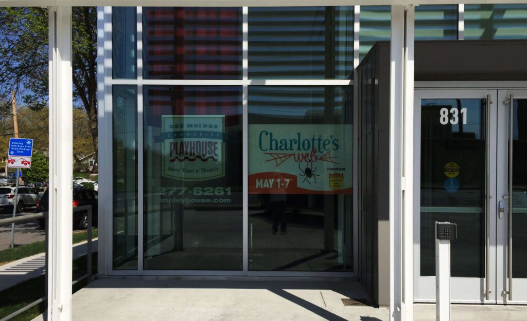
Not a phrase you probably ever thought you’d hear from a print service provider like Beeline+Blue right? But this project was just one such example. The Des Moines Playhouse has contracted with Beeline+Blue for years to produce many different printed pieces in and around their 42nd St. theater; not the least of which is the window graphics on the huge glass-enclosed lobby area, a recent addition to the property. The Playhouse encountered a challenge though. Their beautiful theater is on a busy street, but there’s no signage that presents the building’s purpose aside from the window graphics. And although they’re colorful and informative, because of city regulations the graphics have to be installed on the INSIDE of the windows, which makes them hard to see, especially in bright sunlight (see below).

Window graphics installed on the inside of energy efficient windows can be hard to see, especially in bright sunlight
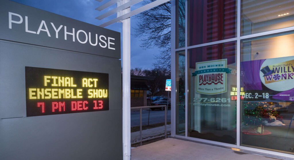
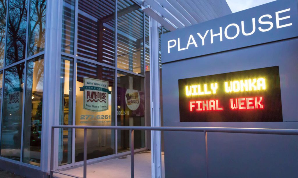
A pedestrian can easily see what production is currently showing, but vehicle passengers go by so quickly that it’s easy to miss the theater altogether. That’s where the idea for this gorgeous, modern sign came from. The Playhouse wanted a way to grab the attention of motorists and convey not only what the currently showing production on the Mainstage is, but what’s playing on the Children’s Theater stage, and what production(s) are coming up next, all within the 2-3 seconds it takes for a car to go zooming by. This sign, with its two-sided digital LED display, achieves that goal and more. In addition, the top part of the pedestal is lit after dark which attracts even more eyeballs.
Why didn’t The Playhouse build a monument-type sign like this a long time ago?
The city of Des Moines is very protective (rightly so in our opinion) of right-of-way and has many regulations in place to discourage businesses and organizations from assaulting the senses of its residents with obtrusive and/or intrusive advertising. The area of the city that The Playhouse is located in is zoned residential, which meant that legally they were allowed only 32ft2 of signage total on the outside of the building. That’s really not enough space for anything substantial when it comes to signage. We believe that the amount of good the Playhouse does for the community and its long-standing place as a historical treasure to the city as a whole warranted an exception to these regulations.

Information at a glance
The idea presented by Todd Richman of Beeline and Mark Trost of Trost Development was to petition the city to rezone the area immediately surrounding the theater as commercial via a PUD (or Planned Urban Development) ordinance. After multiple meetings with Planning and Zoning, some changes to the design in cooperation with Jonathan Ramsey of BNIM Architects, and City Council approval, the project found its legs and was finally installed on December 9th, 2016.
So you might be asking, what does this have to do with Beeline + Blue?
Initially, it was Beeline’s longstanding affiliation with the Playhouse that caused the leadership of the long-running non-profit to bring Beeline on board. We’ve produced hundreds, if not thousands of printed posters, graphics, and playbills for them over the years. With that in mind, Todd was approached to be the point man for this particular undertaking. From beginning to end the Des Moines Playhouse leaned heavily on his knowledge of signage in general and his experience navigating city ordinances and regulations related to signage.

Bright and eye-catching!
It may not be immediately evident from the picture, but this simple aluminum pillar represents 18 months of leg work by the involved parties. There were a few hiccups along the way but armed with dogged persistence and a healthy dose of patience the compelling, stylish sign came to fruition and is proving to be a rousing success.


